
Overview
Decorating a new apartment can be overwhelming, especially when trying to achieve a cohesive aesthetic on a budget. House2Home aims to simplify this process by offering curated décor starter packs tailored to individual styles and financial constraints.
Users often know the ambiance they want to create but struggle to select the right pieces that fit both their desired look and budget. This uncertainty leads to decision paralysis, abandoned carts, and unfulfilled living spaces.
Problem
Solution
Develop a user-centric platform that leverages intelligent design to recommend personalized décor kits. By integrating user preferences and budget considerations, the platform aims to provide confidence in purchasing decisions and streamline the home decorating experience.
Design Process
Day 1: Empathize & Design
I started by diving into user research. I carefully analyzed the provided user interviews and personas to identify the key pain points that were standing in the way of a seamless home décor experience. These included:
Budget constraints
Difficulty in achieving the desired aesthetic
Feeling overwhelmed by too many choices
Struggling to balance quantity with quality
To better understand these challenges, I organized the user sentiments into an affinity map. This helped me identify common themes and get a clearer sense of what users were experiencing.
Next, I formulated a few “How Might We” (HMW) questions to guide the ideation phase:
How might we simplify the decorating process?
How might we ensure users can find items within their budget?
How might we build confidence that the items they choose will complement each other?
How might we give users the flexibility to customize specific pieces from a kit?

Day 2: Ideate
Lightning Demos
I then moved on to competitive analysis, where I conducted lightning demos of industry leaders like IKEA and West Elm. This helped me understand how they solved similar problems and identify areas where we could innovate.
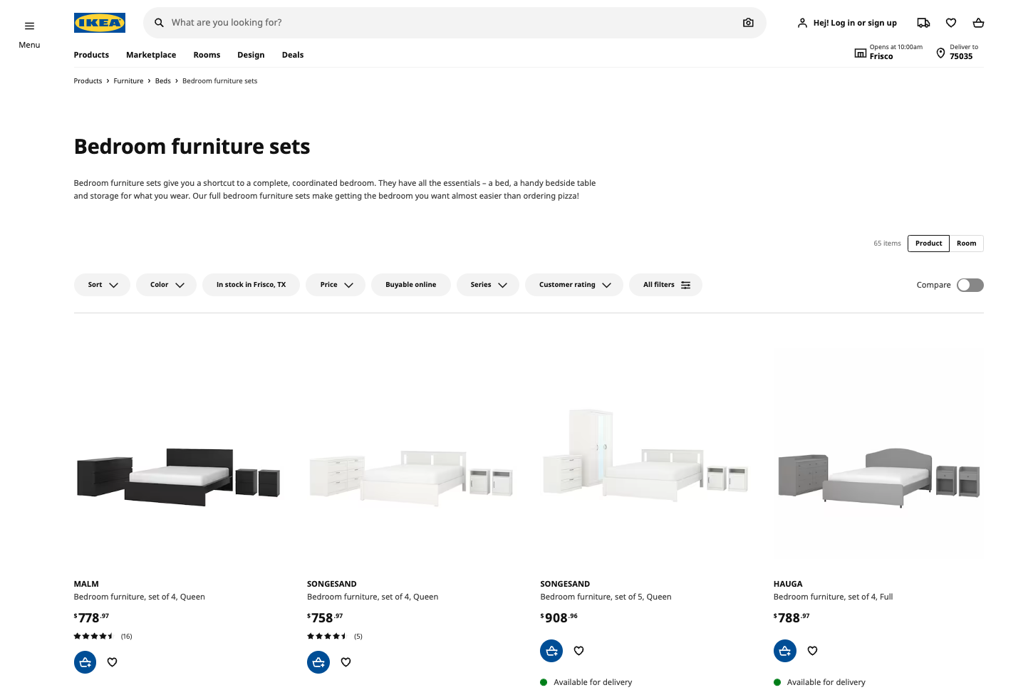
Ikea:
Premade furniture sets
Allowed user to narrow down sets based on the filters they select

West Elm:
Shows which items are in the inspiration image and the prices
Shows how to style selected piece
Shows items in real homes and other items in the collection
Gives user the option to swap out pre-styled items
From there, I jumped into a Crazy 8s sketching session to generate eight different concepts. I focused on the key screen where users would select their décor kit. My main goals were clarity, personalization, and ease of use, ensuring that the final design would be intuitive and aligned with the user’s preferences.
Crazy 8s

Day 3: Decide
At this point, I was undecided on which approach I wanted to proceed with. Both Screen 2 and Screen 3 from my solution sketch could have been used as the most critical screen in the design. I decided to list out the pros and cons of each to see which design I wanted to focus on.

Design 1:
Allows users to see all items in kit working together
The image would be the main element that is changing to show the different options (room size, pieces in kit, etc.)
Allows users to build their own kits
Pros:
Users might like items in image that are not included in the starter kit
Would have to use personalized images for the website vs stock images
Would require either a hover option or new screen to explain details for each item in kit
Cons:

Design 2:
Users could select the starter kit as is and add to cart - less decision fatigue on the user
Simpler UI to design - could use stock images in prototype
Next screen could show more specifics about each item in the kit - would be static information
Pros:
Pre-defined kits - but user could have the option to swap out specific items
Users would only see the items in the kit instead of seeing the items in an actual room
Users might not be able to see the swapped out items in the full picture of the kit
Cons:
I decided to go with Design 1 because it allowed users to have a more complete vision of what the starter kit would look like altogether instead of just seeing 3 random items but not necessarily in a room together. Design 1 also allows users to add and remove items from the kit based on the image they see, giving the users more control and confidence when deciding to purchase the kit.
Final Decision:
Day 4: Prototype
With my ideas in hand, I began mapping out the user journey, from onboarding to kit selection. I wanted to make sure the experience was as seamless as possible.
Using Figma, I developed an interactive prototype where users could:
Input their style preferences and budget
Receive curated kit recommendations
Customize the kit by adding or removing items
Visualize the selected items in a virtual room setting


The prototype for the House2Home design is clean and simple, which allows the images of the kits to be the main focal points for the users.

After navigating away from the home screen, users are prompted to choose which decor style they like or a "Not Sure?" option. Reducing the number of initial decisions down to just what style they like helps make the process more straightforward.

Once in their selected decor style, users are then able to choose which room they would like to decorate and how much they would like to spend for each item. This screen helps ensure that the user only sees items that are within their budget.

When building their kit, users are directed to a screen that allows them to select decor items out of an image of all the pieces together in sample room. This selection process helps ensure the user that all items are cohesive.

Users have the option to select as many or as few items from this kit as they want, giving users the freedom to only buy the specific pieces they want and only as many pieces as they feel are necessary.

Once users decide which pieces they want, they can add them to their cart and purchase them either as a guest or by signing into their saved House2Home account.

Once the shopping is complete, users are then shown a confirmation screen to ensure them that their order was received and will be shipped to them ASAP!
Day Five: Test
Finally, I conducted usability testing with five participants. I wanted to gather direct feedback on the prototype’s functionality and overall user experience.
The feedback I received was incredibly valuable:
Users loved the ability to customize their kits and visualize how the items would look in their space.
They also pointed out that the compatibility between items and the budget tracking feature could be clearer.
Adding a search functionality that allows users to search for what they want
A quiz that would reduce the amount of decisions users have to make (asking them specific questions about their apartment (number of bed/bath, what room they want to furnish, total sq. ft, etc) and then direct them to the kit that would work best for them
Testimonials and customer reviews to see highest rated and recently popular kits
These insights guided the next round of iterations, allowing me to refine the design further.
Based on the user feedback, I added the ability for users to search for specific items and the reviews to each kit/item to the design.
Design Updates


Overall Key Features
Personalized Recommendations
I designed the platform to suggest curated décor kits based on the user’s style preferences and budget. This ensured the experience felt tailored and accessible from the start.Interactive Customization
I built in the flexibility for users to modify their kits—adding or removing items—with real-time updates on total cost and visual cohesion. This gave users greater control without sacrificing design harmony.Virtual Visualization
To boost purchase confidence, I added a feature that lets users visualize their selected items together in a virtual room setting. It helped them better understand how the pieces would work together in their own space.
Potential AI/ML Integrations
As I considered future growth and how to align with AI/ML product development, I identified several opportunities for intelligent enhancements:
Style Prediction Algorithm
I envision building a model that can predict a user’s style based on their initial inputs and browsing behavior, allowing for smarter, more intuitive recommendations.Budget Optimization Engine
Another idea involves developing an algorithm that suggests the best combination of items to achieve a desired aesthetic within a set budget—maximizing value without compromising design.Visual Similarity Detection
I’m also exploring how computer vision could help recommend items that visually align with those a user has favorited, enhancing personalization through pattern recognition.
Next Steps
Data Collection
I plan to collect and analyze user interaction data to train and improve AI/ML-driven features, making the system smarter over time.A/B Testing
I’m interested in running experiments to compare different recommendation strategies and fine-tune the user experience based on actual behavior.Cross-Functional Collaboration
To bring these features to life, I’d work closely with data scientists and engineers to ensure AI/ML capabilities are seamlessly integrated and truly user-focused.
Conclusion
This project gave me the chance to combine thoughtful design with forward-thinking functionality. It reflects my passion for creating intuitive, data-informed products that solve real user problems—and it’s directly applicable to the work I aim to do as an AI/ML Product Manager or Designer. I’m excited by the potential to scale this kind of intelligence-driven personalization across product experiences.