From Backend to Browser: Building Planistry's User Interface
I built Planistry's backend—a FastAPI system that uses CLIP embeddings and Pinecone vector search to match couples with wedding vendors at 93% accuracy. The matching algorithm worked. It processed images in under 3 seconds.
But no one could use it.
One week later, ~ 20 hours across five sessions, I had a complete frontend. 7 pages. 15+ React components. JWT authentication. Dynamic routing. File uploads with category tagging. Two new backend endpoints. Deployed to production at $0/month on Vercel.
The catch? I'd never written a React component before starting.
This is the story of teaching myself Next.js and building Planistry's user interface from scratch. It's about the technical decisions that shaped the build, the features I resisted adding, and the discipline it took to ship something testable rather than something perfect.
Defining the MVP
It's easy to dream big: vendor chat, budgets, filters, wishlists. But none of that mattered yet. To stay focused, I defined the smallest possible set of flows that would validate whether Planistry's AI matching experience actually resonated with couples.
I mapped two distinct user journeys: one for new couples eager to start creating, and one for returning couples seeking orientation. Each flow was designed around a different psychological state—excitement versus progress-checking.
Planistry User Journeys
Sign Up
Names & wedding date
Upload Photos
3-5 inspiration images
Tag Categories
Florals, colors, venue
View Matches
AI recommendations
Explore Vendor Profiles
Portfolios & reviews
Psychology: New users are energized and ready to create—get them uploading immediately.
Log In
Welcome back!
Dashboard
Countdown, moodboard, matches
Choose Action
Upload more or view results
Psychology: Returning users want orientation—show them their progress and what's next.
Two user journeys: New couples start creating immediately, while returning couples get orientation through their dashboard.
That was it — no messaging, no budgets, no wishlists. Just the essentials needed to collect meaningful feedback on whether the core idea worked.
A Minimal Design System
Before writing a single component, I built a small design system to keep everything consistent and intuitive.
Color palette: Blush, Ivory, Sage, and Charcoal → calm, inclusive, and wedding-inspired
Typography: Lato → romantic, readable, and light
Component style: Rounded corners, soft shadows, and mobile-first layouts
The goal wasn’t visual perfection, it was usability. I wanted an interface that felt pleasant but unobtrusive, letting the experience take center stage. Keeping things simple stopped me from over-polishing and kept focus on what mattered most: testing whether couples actually connected with the idea.
Bringing It to Life: Page by Page
Once the foundation was set, I built the core pages iteratively—starting with auth, then the upload flow, then matches and profiles. Each page informed the next, revealing what data I needed and where the experience felt incomplete.
Landing Page
A simple, inviting introduction that explained what Planistry does and why it matters.
Signup & Login
Connected directly to the backend /signup and /login endpoints that returned JWT tokens.
Signup → Store token → Redirect to
/upload(new users start creating immediately)Login → Store token → Redirect to
/dashboard(returning users want orientation)
The flow reflected user psychology as much as system logic: onboarding is about momentum, returning is about direction.
Upload Page
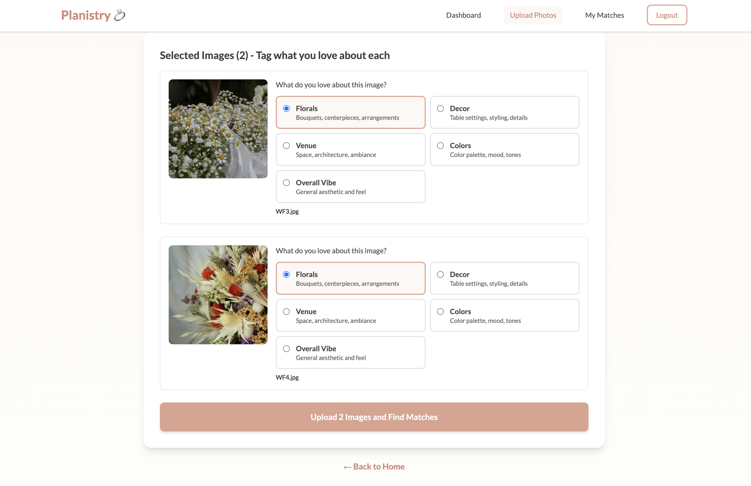
Upload and tag: Couples control what the algorithm weights by tagging specific elements they love in each inspiration photo.
The heart of the MVP. Couples could upload inspiration photos with category tags (Florals, Decor, Venue, Colors, Overall Vibe) and instantly see AI-generated vendor matches.
Category tagging gave couples control over what the algorithm weighted. For example, they could highlight color palettes while ignoring venues—transforming the system from “find similar images” to “find vendors who excel at what couples actually care about.”
Early testing revealed an issue: images uploaded fine but wouldn't display. It turned out to be a permissions gap between Supabase's database and storage policies. A small fix, but a big lesson: good systems aren’t just about locking things down; they’re about opening the right doors to the right people.
Matches Page
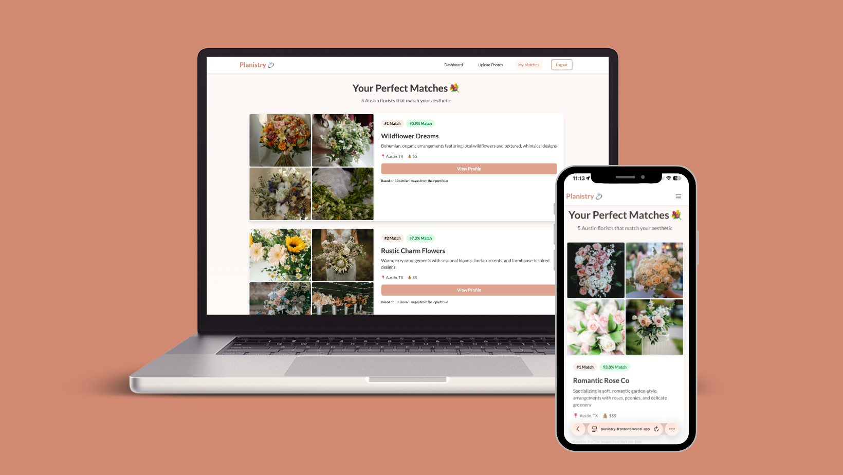
Displayed vendor recommendations in a clean, scrollable list. Couples could explore and click into vendor profiles for details.
Vendor Profiles
Vendor profile page: Portfolio, reviews, and contact information—focused on validation essentials, not feature bloat.
Vendor profiles pulled everything together — portfolios, reviews, contact info, and match explanations. I quickly realized I needed a single source of truth, so I built a new endpoint: GET /vendors/{vendor_id}. It aggregated data from multiple tables and made the frontend much cleaner.
But this was also where feature temptation crept in. Pricing tiers, package comparisons, social integrations—they all sounded essential. Take pricing, for example - it seemed essential. Couples need to know if they can afford a vendor, right? But adding pricing would require:
New database fields for tiered pricing structures
Vendor onboarding flow to collect pricing data
UI for displaying price ranges
Backend validation logic
Deciding on pricing format (hourly? package? starting-at?)
All that work to test an assumption: that couples want pricing before seeing if they even like the matching experience. I had no data supporting that assumption.
I kept asking: Does this help test the AI matching experience? If not, it waited.
That decision kept the MVP focused, fast, and grounded in its purpose: prove that AI matching feels intuitive and useful for real couples before anything else.
Dashboard Page
Returning couples needed a home base. I built a dashboard with a wedding countdown, a moodboard of their inspiration photos, and a preview of their top vendor matches.
Like vendor profiles, this needed a new backend endpoint (GET /couples/{couple_id}/dashboard) to aggregate data from multiple tables—couple profile, uploaded images, matched vendors, and statistics—in one efficient call rather than stitching it together with multiple frontend requests.
See it all in action: The complete new couple journey—from uploading inspiration photos and tagging categories to viewing AI-matched vendors and exploring portfolios. The video also shows the dashboard that gives returning couples a home base with their wedding countdown, moodboard, and top matches.
Connecting and Refining the Experience
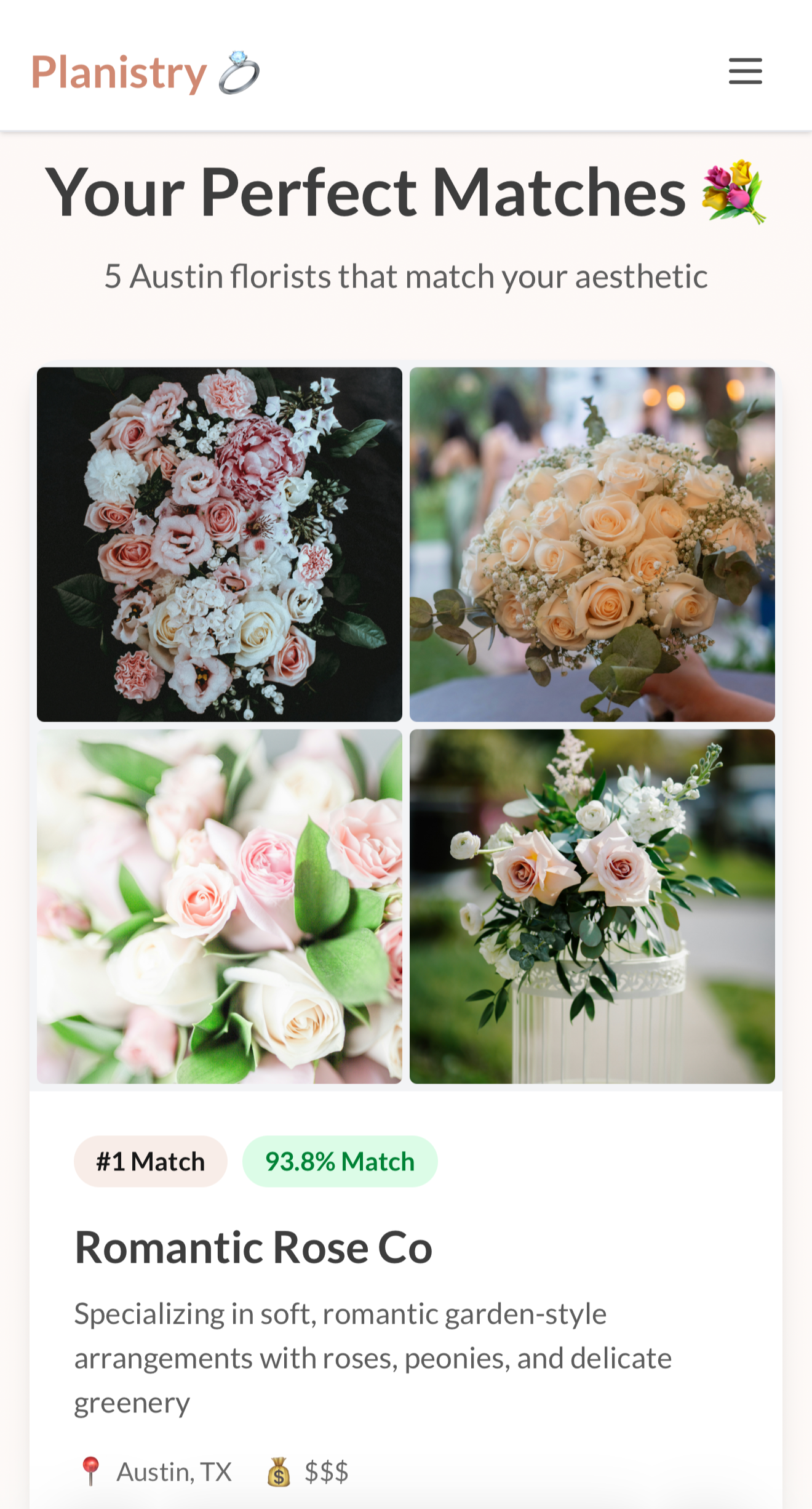
Responsive matches view: Desktop navigation collapses to a hamburger menu on mobile, while vendor recommendations remain clear and scannable at any screen size.
To tie everything together, I added a top navigation bar so users could move fluidly between pages. Desktop users saw a full menu; mobile users got a hamburger icon that expanded on tap. Since more than half of wedding planning happens on mobile—something I kept in mind throughout—every page was built mobile-first, then enhanced for larger screens. I also separated "Log Out" into its own button to distinguish it from navigation links—a small detail that clarified it was an action, not a destination.
With all pages connected, I tested the application myself to catch obvious issues before putting it in front of real users. Several problems surfaced immediately:
Mismatched redirects. Returning couples expected to land on their dashboard after login, not the upload page. New users needed the excitement of creating something immediately, but returning users wanted orientation. I split the redirect logic to match each mindset.
Duplicate vendors. The dashboard showed the same vendor five times instead of five unique vendors. Matches were grouped by image rather than by vendor, meaning a vendor who matched three photos appeared three times. I added deduplication logic on the backend to track which vendors had already been included in the response.
Visual inconsistencies. Misaligned buttons, inconsistent spacing, and varying font weights made the app feel unfinished. I standardized these without over-designing, focusing on cohesion rather than perfection.
Each fix made the experience feel more intentional and less like a prototype.
Making It Real: Deployment
Once everything was stable, I deployed the frontend to Vercel—push to GitHub, auto-detect Next.js, click Deploy, wait three minutes. Cost: $0/month.
When the 'Congratulations!' screen appeared, something shifted. The app was no longer just mine. It existed on the internet, accessible from any device, anywhere. Planistry had crossed the line from working algorithm to working product.
Now I could text the link to engaged friends, recruit couples for beta testing, and reach out to Austin florists about being featured.
What Building This Taught Me
Working with Claude (Anthropic's AI) as my pair programmer revealed an important boundary: AI can teach you how to code, but it can't teach you what to build.
Claude was incredible for scaffolding components and explaining React concepts. But deciding which features would validate my core hypothesis versus which were just appealing distractions? That required the same product thinking I'd honed as a designer—stepping back and asking what users actually need to experience, not just what's technically possible to build.
The hardest part wasn't learning the framework—it was knowing when to stop building and start testing.
From Zero to Deployed
I went from never having written a React component to having a production-ready frontend. Here is everything that was accomplished in just one week:
7 complete pages — landing, signup, login, upload, matches, vendor profiles, and dashboard
15+ React components — from reusable UI elements to file upload interfaces
2 new backend endpoints — one aggregating vendor data, another pulling dashboard info
Secure from day one — JWT auth, Supabase RLS policies, and proper data isolation
Deployed to production — live on Vercel at $0/month, connected to FastAPI backend on Render
Total time: ~20 hours across 5 sessions
Cost: $0
System Architecture
Frontend → Backend → Data Layer
Frontend
Next.js 14
Deployed on Vercel
Backend
FastAPI
Deployed on Render
Data Layer
Supabase
Pinecone
Key Data Flow
Couple uploads inspiration photos via frontend
Backend processes images with CLIP model → generates embeddings
Embeddings stored in Pinecone, metadata in Supabase
Vector similarity search finds matching vendor portfolios
Frontend displays top vendor matches with similarity scores
System architecture: Next.js frontend communicates with FastAPI backend, which handles image embeddings (CLIP), vector search (Pinecone), and data storage (Supabase).
What's Next: Real Couples, Real Feedback
The frontend is live, connected, and functional. Every core user flow works. But "working" isn't the same as "valuable."
I'm recruiting 5-10 engaged couples in Austin to use Planistry, upload their inspiration photos, and share honest feedback. Specifically, I need to learn:
Does the signup process feel approachable, or is anything confusing?
Do category tags make intuitive sense, or do couples hesitate?
Are match percentages meaningful, or just numbers without context?
Do vendor profiles have the information couples need to make decisions?
What features do they expect that aren't there yet?
Their answers will build the roadmap—not my assumptions about what couples need, but evidence of what they actually use and request.
Because the point of an MVP isn't perfection. It's learning what matters.
Interested in early access or know an engaged couple in Austin? Feel free to reach out at joneskristianna@gmail.com!
Key Takeaway
The hardest part of building isn't learning the tools—it's having the discipline to ship something imperfect so you can learn what actually matters. Perfect is the enemy of validation.


